Reading the Plots
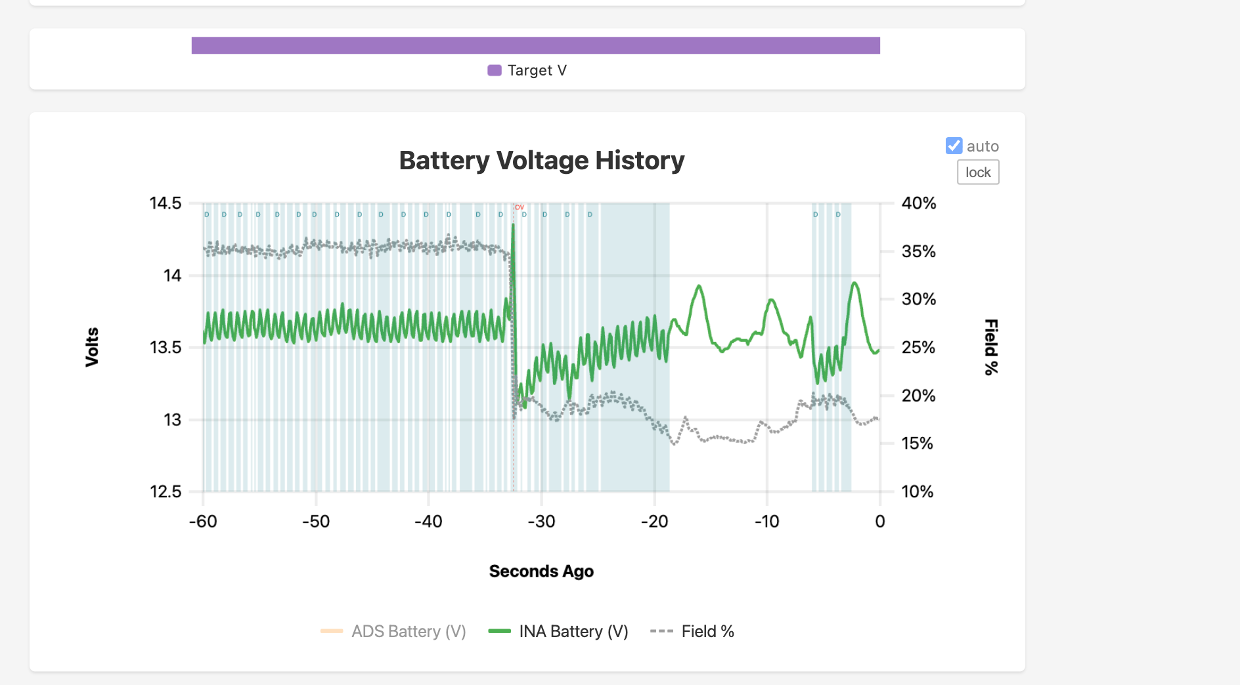
The chart above is a deliberately poor run, chosen because several markers appear at once. It is not what a normal charging session looks like — most runs show few markers or none.
The short-term charts
Four charts scroll together on Plots → Short Term: Current History, Battery Voltage History, RPM History and Alternator Temperature History. They share one time axis, one time window and one set of markers, so an event that appears on one appears in the same column on all four. All four carry Field % as a grey dashed line on the right-hand axis.
Protection markers: OV, iX, LD
A thin red dashed vertical line spans the full height of the chart at every frame in which a current-limiting protection was holding the current ceiling down. A small red label at the top of the line names which one:
| Label | Protection | Meaning |
|---|---|---|
| OV | Overvoltage clamp (Groups 1 and 2) | Battery voltage at or heading above the safe ceiling; the current target was trimmed to stop the rise |
| iX | Current-excess supervisor (iExcess) |
Alternator output ran further above the commanded current than the allowance permits, either near the target voltage or in bulk charging |
| LD | Load dump | A large DC load disappeared abruptly; the setpoint was collapsed to protect the bus |
Two protections binding in the same frame share one line, labels joined by a
middle dot: OV·iX.
Every qualifying frame gets a line; labels are thinned when lines fall closer than about 22 pixels apart, so a dense picket of lines under one label is a run of clamping rather than a single event.
What each protection is and what arms it: Safeties and Protections.
D: the voltage loop's derivative term
A pale teal band across a run of frames, with a small D at the top, on the Battery Voltage chart only. It marks the spans where the derivative term (D) of the constant-voltage loop trimmed the current target — the term that reads how fast voltage is climbing toward the target and eases current back before the target is reached.
Not a protection, and drawn teal rather than red for that reason. It is one span per run rather than one line per frame, because the D term acts on consecutive voltage-loop ticks.
The D term and asymmetric integrator unwind are switched together by CV Tuning Helpers (Setup → Alternator → Tuning → Voltage).
Missing-data bands
A grey vertical band labelled 12 s missing or 4 min missing marks the seam
where telemetry resumed after an interruption — WiFi dropout, backgrounded browser
tab, reboot. Traces break across the seam instead of drawing through absent time.
On a "seconds ago" axis the seam has no width, so the label carries the duration.
Grey, not red: a gap is absent data, not an event.
The charge-stage ribbon
The narrow coloured strip between the Current and Battery Voltage charts is the charging stage over the same window, scrolling with the charts. Wide segments are labelled in place; hovering or tapping names the stage and how long ago it was.
| Colour | Stage |
|---|---|
| Blue | Bulk |
| Orange | Absorption |
| Green | Float |
| Cyan | Maintain |
| Purple | Target V (a directly commanded voltage target) |
| Pink | Manual |
| Grey | Idle |
| Brown | Commissioning |
| Red | Shutdown |
The legend lists only the stages present in the visible window. A bare grey track is a span with no stage recorded.
The long-term charts use a different palette for the same stages, matching the charge-stage badge in the dashboard header.
Chart controls
These repeat across the dashboard's charts:
- auto (checkbox, top right) fits the Y axis to what is on screen. lock freezes the current fit so a spike cannot re-range the axis mid-watch.
- Click the Y axis to type exact minimum and maximum values. Clearing a value returns that axis to automatic.
- Drag a box to zoom; double-click resets.
- The Time Window buttons (5 s to 5 min) set the visible span for all four short-term charts at once. The highlighted button is the current setting.
- Time Axis Labels switches between relative labels ("seconds ago", smoother scrolling) and wall-clock labels.
The long-term charts
Plots → Long Term draws the XREG-010's recorded history rather than the live stream. Each point is a completed averaging window (about ten minutes), so the newest point can be up to one window old; the banner at the top counts down to the next one and offers a one-tap refresh.
| Marking | Meaning |
|---|---|
| Solid line | Average across the window, counting only time the engine was running |
| Faint dashed line, same colour | Same quantity averaged over the whole window including engine-off time. The two separate where a window mixes running and resting |
| Shaded band | Lowest and highest values inside each window |
| Red dashed vertical line | Now — the live edge of the recorded history |
| Broken line | No record for that window |
| Dots instead of a line | Eight or fewer points in view; an isolated point would otherwise be invisible |
Two readouts follow the cursor below the charts:
- Engine on: 62% — how much of that window the engine was running.
- · 14.2 Ah on the current charts — charge delivered during that window, as opposed to the average rate.
One charge-stage strip sits above the charts and covers all of them: green Bulk, purple Absorption, amber Float, red Manual, light green Maintain, blue Target V, slate Idle, brown Commissioning. It paints each pixel column with whichever stage held it longest, so zooming in reveals short stages instead of averaging them away. Spans with no stage recorded are left as bare track and appear in the legend as Not Charging.
The time-range brush at the top drives every chart together: drag its handles, or use the 1 h / 6 h / 24 h / 7 d / 30 d / All buttons. Dragging horizontally on any chart zooms all of them.